Of the hundreds of thousands of free fonts on the web, only a tiny handful are ‘text’ fonts suitable for plain text. Some of these have bold and italic variants, perhaps even small capitals; but almost none offer different optical sizes. In fact, when I began this project, not a single freeware font existed with a rich set of glyphs, weights and optical sizes.
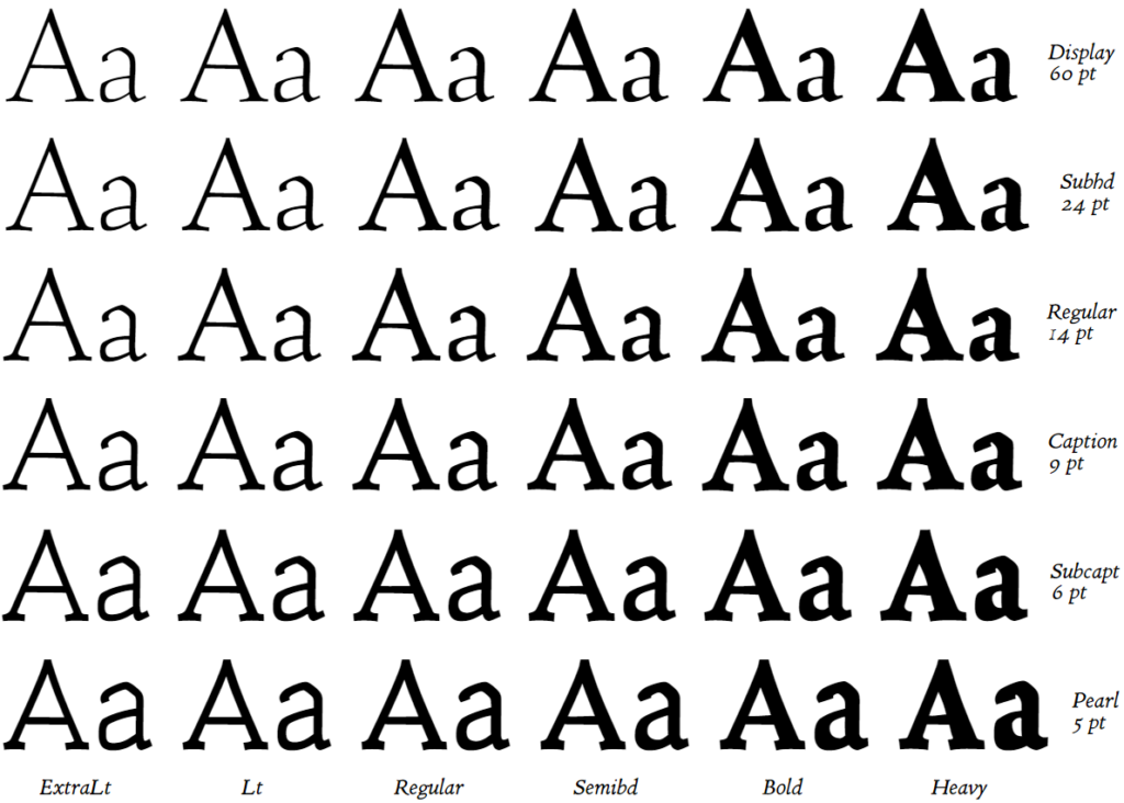
Taking up the challenge, I have been creating Coelacanth, a typeface inspired by Bruce Rogers’ legendary Centaur, described by some as the most beautiful typeface ever designed. There are surprisingly few digital revivals of Centaur, and none that I know of providing the smaller optical sizes that were available in the original metal type. Centaur was tremendously versatile, as elegant and readable in the smallest caption text as it was at display sizes.

Coelacanth is a work in progress. It has a large number of glyphs for European languages, Greek and Cyrillic, as well as small and petite caps, contextual glyph variants and advanced kerning. However, these are incomplete or need redesign in some styles, weights and sizes, and Cyrillic in particular needs a lot of work. My immediate goal is to get the basic glyph set looking good across roman and italic at all weights and sizes, so this becomes a rudimentary usable type-family. Then I will be gradually fleshing extended glyph support.
I do most of my design work at the extremes of light and dark, very large and very small type-sizes — plus a regular weight and a regular optical size. The remaining fonts are then interpolated from these masters.
Coelacanth R14 glyphs font features and kerning test sheet

An italic is underway, rather different to the Arrighi that has standardly accompanied Centaur. Arrighi was an independent design with no relationship to Centaur; and I hope to give the new italic a stronger link to Centaur‘s distinctive DNA. An alternative italic closer to Arrighi may eventually be offered as well.
UPDATE:
Coelacanth has made a lot of progress since this post was first made. It now has Italic and Roman at all weights/sizes, and has a wide range of glyphs and many advanced features. It’s still in progress, and I hope eventually to release it as a variable font. The most recent versions of the Coelacanth family can be found at the Coelacanth GitLab repository, where you can also view current issues, request features, etc.
Dear Ben Whitmore, your Coelacanth is amazingly beautiful; however I discovered that, even if the regular variant of the font has all 4 standard ligatures (from unicode FB00 to FB004), the italic variant has, yes the standard ligatures, but they are not italic, but in regular style (so they are not usable for advanced typography); do you plan to replace these with more proper standard italic ligatures? I planned to use it in my next book, but due to lack of proper italic ligatures I cannot use. Thanks for any info. I would prefer to use Coelacanth, rather than use a commercial font, and donate an amount of money raised with book sales to the Coelacanth project. Thanks for any info.
Thanks. This was a pre-release, and there are still many gaps in this family. The regular 14pt is a lot more complete than some of the other weights, optical sizes, and of course italic.
I’m doing a lot of work on this family at the moment, so I could probably build those ligatures for you quite quickly.
If you let me know any other specific problems that need addressing for you to use Coelacanth, I may be able to fix them for you, and put out another beta release.
I’m really keen on open-source, and I’m very happy if people publish with this font free of charge. I’d also welcome donations if anyone feels inspired to contribute in that way.
Many thanks, I suppose you’ll post new releases also on Open Font Library since surely there are many happy users who discovered Coelacanth through the openfontlibrary site. (This is the way I discovered it)
Yes. And I’ll let you know as well.
Hey Ben
I have a bit of an issue. I admire you for releasing this as an OpenFont and I really like the look of your font, so much that I did the entire layout for a festschrift using it. There is only one problem … I am unable to output anything to pdf, ps or print. The postscript file generated by QuarkXPress on the Mac is corrupted. It cannot be viewed, printed or converted to pdf. Direct output to pdf also fails to generate a file. This book is about to be sent off for proof reading so I am in trouble. I’d have to buy Centaur online and redo the entire layout (it’ll hardly be similar enough over 300 pages to avoid text and footnotes shifting). Is there anything you can do to help me out? Drop me an email if you get the chance to let me know if there is any hope.
Best regards
Geir Rosset
Oslo
Norway
I’m not aware of anyone else having found a problem like this… Perhaps there’s some simple problem, such as that you haven’t embedded the font in the generated PDF? I last looked at QuarkXPress 17 years ago, so I can’t be much help there… If QuarkXPress displays the poster fine onscreen but produces a corrupted PS file (without raising errors or warnings in the process), then I would consider this to be a problem with QuarkXPress. There could conceivably be a problem with the font file(s) as well, which is triggering QuarkXPress’s failure, but it’s very hard to know what that problem might be (if any).
If you come up with any more information that narrows down the cause of the error, please let me know. Thanks, Ben
Hi Ben!
Coelacanth is beautiful. Thank you for making it freely available. I can’t wait to see (and use!) the finished product 🙂
I’d like to send a donation your way. How might I go about doing that?
I have no problem with pdf output with Libreoffice or othwe wordprocessors/dtp programs like Scribus in Linux
Since Geir Rosset runs OS what he runs he should download libreoffice for his OS (MacOs) and output a test pdf from libreoffice/openoffice (it is the same)
In my opinion it is not a font fault per se
I’m expecting the final release with italic ligatures to use in books but also in this present releases pdf output is every time fine adn I cannot see problems in fonts
I found your font through the openfontlibrary site. I must say that the work done so far is quite good. I’m writing my PhD and I’d hope to use this superb typeface for the final version (within two years)…
Dear Ben Whitmore
I would be most grateful to know when Coelacanth is complete. I use Centaur for my books (don’t pay any attention to my prmitive old website) and although I love it I am aware that the Monotype is far from perfect.
Many thanks, Anthony
Thank you kindly, sir! (hat down)
dear Ben
This font is beautiful, but, as said, not fully usable until you not add the proper ligatures, from FB00 to FB04 (ff,fi,fl,ffi,ffl) to italic variant (for now, the italic variant has the ligatures in roman style that is an error; since ligatures of italic varianrt need to be also in italic not in roman style)
since this is an hard work and the font is valuable, why not run a campaign onkickstarter or similar sites? You can decide the amount of money needed and let people selert their affordable quota to finish the font in order to be fully usable
good fonts
Thank you very much.
Hello Mr. Whitmore. I recently discovered Coelacanth and I think it’s beautiful. Thanks so much for this work. It’s amazing that you were able to cover such a vast field of glyphs. I’m an academic who writes regularly about ancient Greek, and it’s very exciting to discover a new polytonic font—something which happens very rarely indeed.
But…I a couple of fundamental problems with Coelacanth, which ought to be really easy to fix, although I do not know how to do so. For some reason, the following two glyphs are unusable, because of a weird problem: (1) lowercase phi (φ = U+03C6 = glyph ID: 571 = character code 966), and (2) the cursive variant of theta (θ = U+03D1 = glyph ID 582 = character code 977). Both of these glyphs include a small, detached x floating above the letter itself. The second glyph is a variant, which is definitely not required for full use of the polytonic alphabet (though it’s nice that it’s included) but φ is, of course, a very common letter. What’s the deal with these? Can you fix it, or else recommend a course of action I could take to find someone else who could do so? I would be happy to do it myself, but I know nothing about FontForge or any program for making fonts, and it seems like a daunting learning curve just to fix this very simple issue.
I’m sorry you found that problem. I really hadn’t considered the greek glyphs ready for use, and I had included the little cross as a marker for myself to revisit it.
It’s now in much better shape and has lost the cross — I just have to make a second release that incorporates the many improvements of the past couple of years. I must get on to that. –Though note that Greek characters are at present only properly supported in non-italic, standard weight and standard optical size.
Thank-you very much.
Great fonts, thank you so much 🙂
Cœlacanth is beautiful. Are there any new releases, including the optical weights and italics? I have the 20140829 release but I wonder if there are newer? Where’s the canonical home for it once it has a “proper” release, OFL? Thanks again Ben, it is lovely.
Beautiful, but: in R24 the capital Q is broken (at least on my screen!).
Dear Ben,
thanks for Coelacanth!
Small nagging point:
The kerning for the pairs
f”
f’
f|
f?
f!
f)
f]
f}
is far too close (touching, even).
(I used the kerning demo page from Bringhurst’s “Elements of typographic Style”,
XeLaTeX version on http://uklmdcb7ijczd3ij.onion/ )
Dear Ben Whitmore,
I really appreciate your beautiful Coelacanth font type, which I would like to use in LaTeX.
However, I am not able to use it in Hungarian, as the top of the umlaut on the “ő/Ő” and “ű/Ű” characters is not at the same height.
See https://tinyurl.com/y2jtoel8
The requested font face is shown here:
https://tinyurl.com/y2kszsab
Would it be possible to make such a change in the font?
Thank you very much
Hello Ben,
I released my debut historical fiction novel, The Stone Cutter, in late September of 2023, setting both the book’s body text and front cover title in the Coelacanth type family. The book has garnered a book of the year award, as well as being short-listed for the Eric Hoffer Award’s Grand Prize and First Horizon Award. It has also gained acclaim for its aesthetic design and attention to detail—thanks in large part to your wonderful typeface project. In the book’s colophon, I showcased the Coelecanth family, giving you explicit credit.
Thanks for that feedback, Brock! I’m so pleased that it’s getting used as I hoped it would, and the book looks great! It’s very kind of you to mention me and Coelacanth in the colophon.
I’ve loved your typeface for years, having downloaded it from a website without knowing it was a work in progress. It’s only recently that I’ve discovered the extent of the work you’ve done in recent years, with the multiplication of optical sizes. It’s just fabulous ! Now I can start using Cœlacanth professionally. Are you planning to create a variable version of your font ? I imagine this would be a lot of extra work, but it would be an important step towards perfection.
Thank-you! Yes, I do hope to create a variable font version, but it is a lot of work. A huge amount of work, actually, even with various software automations that I’ve cobbled together. As I only manage to work on this sporadically, I expect it may be at least a couple of years before that comes to fruition!